Chat GPT 4 Outperforms GPT 3 - Unlock Design System Potential
A Comprehensive Comparison between GPT 3 and 4
Last December, I wrote an article about how Chat GPT can help us with design systems. Now that the new version, Chat GPT 4, has been released and I of course have a Plus account, I want to test the same things again and see how much better version 4 has become in relation to design systems.
Core Principles
Once again, I ask Chat GPT if it can write core principles for a design system for me. In the images below, I always compare the output of Chat GPT 3 and 4 to create a comparability:
GPT 3.5
GPT 4
Comparison
It is noticeable that in version 3.5, almost every description starts with "A design system." As a result, the text is relatively boring and annoying to read. In version 4, each text is different and relates much better to the actual principle. This is already a significant improvement.
The second point is that 3 more principles have been added:
Usability
Flexibility
Version control
Especially the point "Usability" is a very important aspect that is often forgotten. This is because a design system must also be user-friendly for designers and developers.
So, we have already received more and better content with version 4.
Color Palette
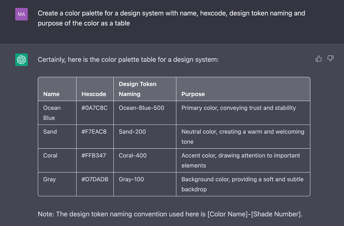
Again, I ask Chat GPT if it can create a color palette for me. I also ask again if it can provide me with a name for design tokens, a purpose, and a hex code. It should be noted that I have entered the exact same prompt again.
GPT 3.5
GPT 4
Comparison
Isn't that crazy? It's exactly the same prompt, but the result from version 4 is so much better. Version 4 understood right away that I don't want to see "Ocean Blue" in a design system, but rather "Primary". In addition, it also created semantic colors for me that I didn't even ask for, but it's clear that you need them. So version 4 has become significantly smarter here and I don't have to improve every single step. Great!!
Typography
Of course, we not only need principles and a color palette but also a typescale for our design system. Therefore, I ask Chat GPT to create one for me. I intentionally asked the question relatively vaguely to see how much it would be interpreted.
GPT 3.5
GPT 4
Comparison
This comparison is very interesting. Version 3.5 gives me 6 styles and Version 4 gives me 8 styles. Version 3.5 considers that there are different headline sizes and names them classically as Headline 1-3. Version 4 also suggests 3 headline sizes, but they are named Display, Heading, and Subhead, which are more tied to their intended use. Both are correct, but I would like at least two more headline sizes in both versions, as we usually have H1-H5 or even H6.
I like the additional text styles such as "Body L", "Label", and "Button" in Version 4.
It is noticeable that Version 3.5 apparently gives the line height in (R)EM, while Version 4 sticks to pixels. Both are correct, but why the difference?
I really like that instead of "Font family", Version 4 suggests the "Use case". It makes much more sense to me, as the font suggestion is secondary here.
Version 3.5 has given more context with a lot of text below the table, which is somewhat useless. What I found more exciting was that the output from Version 4 was on point.
Iconography
Same game. I ask Chat GPT which icons are free and open source and which icons are mainly used for eCommerce apps.
GPT 3.5
GPT 4
Comparison
The difference may not seem big, but it is. Instead of 4, I am now suggested 5 icon sets, but the most important difference is that GPT 4 provides me with direct links to the icon sets. That's great!
Even in the list of eCommerce icons, GPT 3.5 gives me a lot of unnecessary information, while Version 4 provides more output and is more precise.
Design Tokens
I am also looking for help in creating a design token table. Let's see where the difference lies this time.
GPT 3.5
GPT 4
Comparison
Okay, it is very clear how much smarter GPT 4 is. Not only does it provide significantly more output than its less intelligent counterpart, but the table is also much better formatted and provides categories in addition to the token name. In parentheses next to the hex codes for the colors, it even includes the name of the color. Furthermore, GPT 4 not only thinks about the border radius but also about width and color, as well as spacings and typography in general.
Conclusion
In the last example, it becomes very clear how much smarter the new version of our little AI friend has become.
When I did some initial tests with GPT 4 today, I wasn't as impressed as I expected to be. However, when comparing the versions directly, it becomes very clear how much better the new version is.
In our specific example of the Design System helper, the new version was able to excel with significantly more helpful and precise answers.
I had hoped to also get access to the new image processing feature directly, but apparently that can only be accessed through an API or is not yet public.
In any case, I am very excited to see what's next and look forward to further tests.


Really interesting writeup Chris. I think there's a core problem with the principles: if you have 10 principles you've already failed ;)
The big thing I've been thinking about is the output of ChatGPT is useless unless you understand the 'why' behind what's being proposed. Otherwise you're just acting on the whims of a black box that you don't understand. I worry there will be a generation of people who get to a certain point, without understanding any fundamentals, and are unable to continue their growth as a result. Concerning times.